



A familiar promise.
A sharper expression.
From Parcel Recharge to RocketFuel Recharge.
Explore the rebrand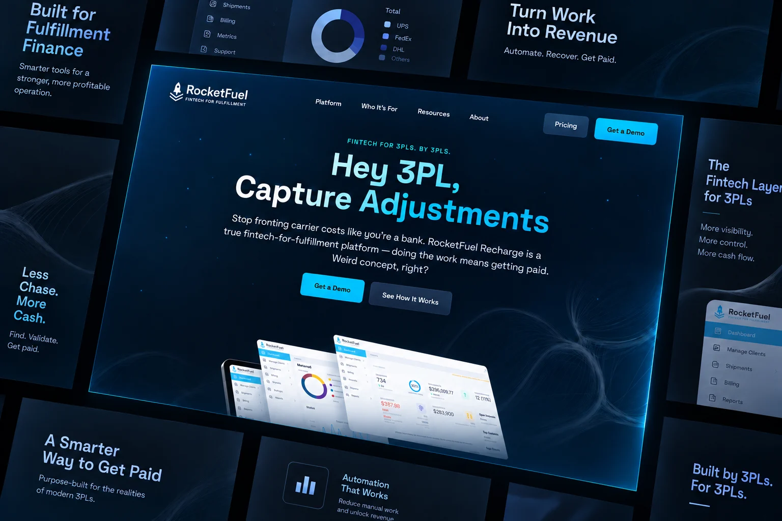
AI-generated website presentation based on the marketing site; not an exact product capture.
The difference
is in the detail.
White and cyan became a darker, more focused visual system. A compact identity, clearer audience language and direct demo path bring the current marketing site together.

Capture dates & archive limitations
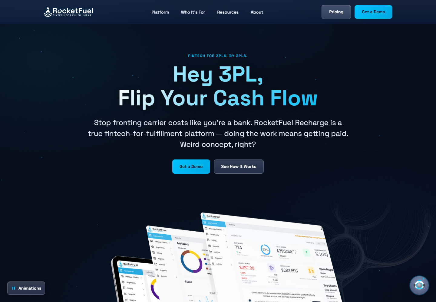
January 5, 2025 Wayback replay compared with the October 9, 2026 live capture. The replay has an oversized header logo; it is not a pixel-perfect record of the original site. Dates are capture dates, not launch dates. SaaS UI shown in artwork was not designed or built by Jake.
Then / White & cyan.
Now / Navy & bright cyan.
Visual palette comparison from the site captures, with approximate colors. The updated logo appears in the current site frame above; final production color values belong to the brand guidelines.
Find what matters.
Make it clearer.
We looked at where design in the 3PL SaaS space was heading, then spoke with multiple 3PL owners about what mattered to them. Audience affinity data, keyword analysis and persona development helped shape the direction.
Research and project scope confirmed by Jake, October 2026.
- 01 The market
- 3PL SaaS design.
Where the category was heading. - 02 The conversations
- Multiple 3PL owners.
What mattered to them. - 03 The evidence
- Affinity, keywords
and audience personas.
A clear direction.
Carried through.
Research became a new color palette, logo and brand guidelines. The website carried that direction through, giving the brand a more cohesive presence.
Approximately 3–4 months of core work. Start and rollout windows below are approximate, as recalled by Jake; individual phase dates were not recorded.
- 01
Understand.
Category direction, owner conversations,
Context
affinity, keywords and personas. - 02
Define.
Updated palette, logo
Expression
and brand guidelines. - 03
Make.
Bring the identity into the website
Application
and roll it out cohesively.
Jake’s role / Marketing ownership and website delivery.
Product UI: consultation now; no original design/build credit.